The Psychology of Color: What Colors Mean and What They Can Do
To speak of the psychology of color is to speak of emotions. It’s like a language capable of evoking pleasure, happiness, restlessness, energy.
It’s more than marketing. Colors are rooted in personal experiences, in our childhood and in a symbolism that science and psychology have sought to figure out.
Claude Monet used to say that the world of color was his daily obsession, his joy — and also his torment. If it’s not easy for an artist to capture the subtlety of each tone and color combination, it’s even harder to define how each color impacts humans and their behavior.
In fact, some even now see it as a pseudoscience, and there’s some truth in it. Because one thing we’re clear on is that color has a lot to do with our personal preferences, experiences, upbringing and even with cultural differences.
However, and here is perhaps the most interesting idea of all, there are many studies that explain how people react to certain colors and talk about which ones are the most popular.
One of the most interesting books on the subject is “Psychology of Color: how colors act on feelings and logic“ by the psychologist, sociologist and professor of communication theory Eva Heller.
This interesting work is the result of years of research, surveys and observations concluding with truly interesting data that coincides with many studies that were carried out before and after hers.
The psychology of color: what is its purpose?
Colors stimulate our brain in very different ways. Actually, in the past, Egyptians and Chinese linked the effect of color with the idea of healing, encouraging certain states of consciousness or emotions.
For example, red to the Egyptians was a reflection of life, the land, victory and also the fury of hostile gods like Seth or Apophis.
Color, in essence, is much more than an optical phenomenon. That is, all have their own meaning. All have a specific impact on our brain, and therefore, the psychology of color is today a basic and essential tool in neuromarketing.
Understanding how the consumer reacts to certain color stimuli can lead to higher sales. Although it’s not always 100% correct, we can see similar patterns of reaction that show us that, indeed, the psychology of color is useful.
Likewise, we can’t forget the effect that color has on the world of art and cinema. David Lynch, for example, is a director obsessed with escaping from the world of logic to immerse himself in the subtle kaleidoscope of emotions.
And in his productions he always uses the contrast of black and white because, according to him, it symbolizes the flight from the real world to the dreamlike.
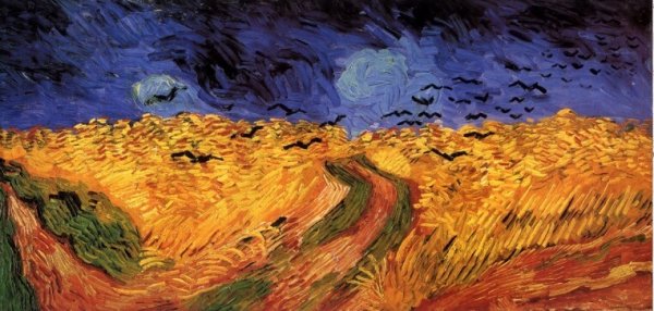
Van Gogh also deliberately chose certain tones to express his emotional states, always leaving the more vivid shades of yellow and blue to give shape to his fields and starry nights.
What each color means and what it can do
Now, let’s dive into the psychology of color. We’ll look at studies carried out by Dr. Eva Heller in her book, as well as the current work of the psychologist and Stanford professor Jennifer Aaker. She recently wrote an interesting analysis of colors applied in the world of neuromarketing.
Blue
- Blue is the most widely used color is offices and business because of how productive and not intrusive it is.
- It is a color that suggests a sense of confidence and trust in a brand.
- Blue has been proven to suppress people’s appetite, therefore it shouldn’t be used to advertise food.
- It is the color of harmony, fidelity and sympathy.
- It is the coldest color but it is still linked to the concept of spirituality and fantasy.
- There are 111 shades of blue.
- It is a primary color, and for painters, the most popular shade of blue was the “ocean blue.” It was the most expensive but gave their paintings an exceptional vividness.

Red
- Red is also one of the most widely used colors in marketing: it stands out from the other colors, is appealing, and is used to attract attention.
- It increases people’s heart rate and creates a sense of urgency, danger or immediacy.
- Red is used to stimulate the appetite and encourage impulse buys.
- It represents love as well as hate.
- Red is the color of kings, joy and danger.
- It represents blood and life.
- It is a dynamic, seductive color capable of awakening our most aggressive side.

Yellow
- In marketing, it represents optimism and youth.
- It represents clarity and is often used to draw attention to certain products on the shelf.
- It shouldn’t be overused in stores because it quickly tires the eyes. That’s why it is usually used more on peripheral shelves than on the central shelves of a store.
- Some studies show that deep yellow tones cause babies to cry.
- For experts in the psychology of color, yellow is a contradictory color: it represents both good and bad, optimism and jealousy, understanding and betrayal.
- Yellow illustrates and favors creativity.
- It is a masculine color, and in China it represented royalty.

Green
- Green is the color of growth, renewal and rebirth.
- It is associated with health, nature, freshness and peace.
- It helps with problem-solving and encourages freedom, healing and tranquility.
- Dark green represents money, economic matters and the bourgeoisie.
- There are more than 100 shades of green, the ones closer to the middle being mood-boosters.
- It also represents budding love.
- Green is a color that helps us to relax. Actually, it’s useful for people with depression.
Black
- The color black is associated with elegance, secrecy, mystery and also power.
- It generates strong emotions, and it’s an authoritative color.
- In the world of fashion it is considered stylish and as conferring sophistication.
- There are 50 shades of black
- It also symbolizes the end of something: death, loss.
- In the past it represented priests and now it represents conservative people.
- In the world of physics, black absorbs 100% of direct light, and therefore does not reflect any length of the spectrum, which is why throughout history the color black has been associated with danger, evil or the like.

White
- In the psychology of color, white symbolizes innocence and purity.
- It represents beginnings, the will to start something new.
- White brings openness and honesty to a space, as well as a sense of peace, healing and tranquility.
- It is associated with perfection.
- There are 67 shades of white.
- A white collar on clothing symbolizes status.

Purple
- In marketing, beauty or anti-aging products often use purple.
- It is calming.
- Many brands use it to represent creativity, imagination and wisdom.
- Purple and femininity, magic and spirituality go together.
- There are 41 shades of purple.
- When we use it too much, it generates ambivalence: experts advise against painting whole rooms this color.
- Purple symbolizes power, but also ambiguity.

Orange
- In marketing, it is associated with enthusiastic shopping, and it reflects emotion and warmth.
- However, if an intense orange tone is used, it can be associated with aggression. Therefore the tone should be soft, friendly and comfortable.
- It is a favorite in the world of advertising because it encourages buying.
- It is associated with transformation and Buddhism.
- Orange not only favors positive emotions, it also generates sensations of “flavor”.
Pink
- Pink symbolizes charm and courtesy.
- In marketing, consumers associate it with children or romanticism.
- It is the shade of erotic tenderness.
- Pink symbolizes the sweet, childlike, and small.
- It was Madame de Pompadour’s favorite color.
Maybe you don’t agree with these descriptions — or maybe you will. As we pointed out at the beginning, the impact of each color sometimes depends on our experience. However, commercially and artistically these basics are useful and effective.
Other colors are missing from this list, like brown, gold, silver or gray. We’ve limited the list to the most impactful colors, those that the art world and neuromarketing use more often and — almost without us noticing — secretly influence us.